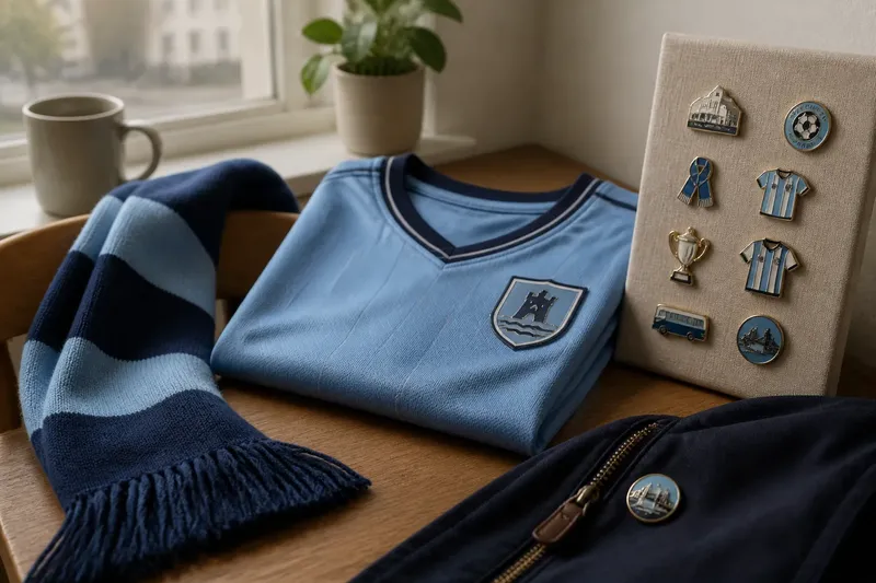
The Club Crest Before the Modern Badge
The club crest before the modern badge shows how heraldic devices became football identifiers, helping supporters read belonging, place and shared identity.
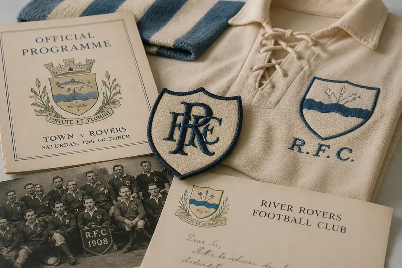
The club crest before the modern badge was often a borrowed heraldic mark, not a purpose-built logo. On a programme cover or a player’s shirt, it could identify a team through a town’s arms, a local institution’s emblem or a device adopted for a particular occasion. Its meaning came partly from what it depicted, and partly from the community that recognised it.
That distinction explains why early football emblems rarely followed one settled design rule. A club might use a civic shield in print, initials on a kit and a different motif on a letterhead. These marks were related, but they did not yet need to behave as one tightly controlled visual system. To understand the modern badge, it helps to follow how heraldic language was adapted, simplified and made repeatable.
Marks before badges
Heraldry offered clubs a ready-made visual vocabulary. Shields, beasts, crowns, crosses and plants could point towards a place, a patron or an older civic identity. A football club did not have to invent every symbol from scratch: it could draw on emblems already visible on municipal buildings, official documents or the clothing of local organisations.
Using such a device did not necessarily mean that a club held an official civic status or had a direct institutional relationship with the body represented. A crest could be borrowed, adapted or used by permission; sometimes the connection was simply a shared association with the town. The image’s presence on a football item is evidence of its use there, not, by itself, proof of a formal bond.
Nor was every early identifier heraldic. Monograms, plain lettering and simple geometric marks could work just as well, especially where space or production methods made a detailed shield impractical. The important point is that a club’s identity was distributed across objects and occasions rather than concentrated in a single, consistent badge.
Heraldic language
A traditional coat of arms is not merely a colourful picture inside a shield. Its components can have names and conventions: the shield carries the main design, while a crest, motto or supporters may form separate parts of a fuller achievement. In everyday speech, people often call a football emblem a crest regardless of whether it includes those formal elements. The terms overlap in common use, but they are not always exact technical synonyms.
For clubs, heraldic forms offered recognition at a glance. A shield provides a clear boundary; a distinctive animal or plant remains legible as a silhouette; a short motto can express an aspiration or local attachment. Colour also matters, although old printed versions could vary with the available ink, paper and reproduction process. The same emblem might look different on a programme, a banner and a stitched garment without each variation representing a deliberate redesign.
Look closely at an old mark and separate its parts before interpreting them. Ask whether the device is a town emblem, a club’s own initials, a date, a local landmark or a decorative flourish. That simple reading avoids treating every element as a coded statement. Some details carry a specific association; others may have been chosen because they balanced the composition or reproduced well.
From civic mark to club sign
When a club adopted a civic or institutional emblem, it gained more than a convenient illustration. The mark could place the team within a wider local story, suggesting that the club belonged to a community rather than existing as a sporting unit alone. Yet the relationship could change as the club’s audience, administration and public profile changed. A borrowed sign might gradually be understood as the club’s own, even if its original associations remained visible.
This shift is easier to grasp by thinking of an old key passed between households. The object retains traces of its earlier owner, but repeated use gives it a new everyday purpose. A civic device on football stationery could similarly acquire a sporting meaning through continued appearance, without erasing its older associations.
Imagine a fictional club that prints the town’s river emblem on its match programme, then places a simplified river line beside its initials on a shirt. The first image points plainly to the town; the second makes the same local reference part of the club’s own identifier. A reader comparing the two could see how an inherited symbol becomes more specific through selection and repetition, without assuming that the club invented the river motif.
Print, cloth and constraints
The medium shaped what an emblem could do. A printer could reproduce fine lines on a carefully prepared programme, while a shirt maker needed a design that could be cut, woven, embroidered or applied to cloth. Small details might blur, disappear or become costly to reproduce. A mark therefore often had to survive practical changes of scale and material as well as carry meaning.
These constraints encouraged simplification, but not every simpler version signalled a new philosophy. A single-colour mark might reflect the limits of a particular print run; an outlined shield might be an adaptation for stitching. Conversely, a more elaborate version could appear on formal documents because there was room for it. Variants need to be read in context: what object was it made for, and what could its maker reproduce?
That context also helps distinguish a club emblem from other football imagery. A league insignia may identify a competition, a manufacturer’s mark identifies a supplier, and a sponsor’s name identifies a commercial relationship. All can appear near the club badge, but they answer different questions. The badge says whose side this is; the neighbouring marks may say who made the shirt or organised the contest.
Why did club marks change?
Was every early crest officially granted?
No. A club might use a civic device, a locally familiar symbol or its own initials without possessing a formal grant of arms. The image’s source and the club’s right to use it are separate questions.
Why do old versions look inconsistent?
Different objects demanded different treatments, and reproduction could vary between printers and makers. A change in detail may reflect the medium rather than a settled decision to replace the club’s identity.
What makes an emblem heraldic?
Heraldry uses recognised forms and conventions, often centred on a shield with defined devices and colours. A football badge may borrow that appearance without being a complete or formally structured coat of arms.
How can a symbol become a club identifier?
Repeated use links an image to the team in supporters’ minds. As the mark appears across club materials, its sporting association can grow alongside any civic or institutional meaning it already carries.
Reading an old emblem
When comparing historical examples, begin with the object rather than the image alone. Note whether the mark appears on a programme, a letter, a pennant or clothing, then look for the maker, date or wording printed nearby. The surrounding material can reveal whether the emblem served as a formal seal, a decorative motif or a practical identifier.
- Compare the outline: is the mark built around a shield, a circle, a monogram or plain lettering?
- Separate image from text: are the initials, motto and date integral to the design or added around it?
- Look for local references: does a building, plant, animal or civic device connect the mark to a place?
- Check the medium: could the detail have been altered to suit printing, weaving or embroidery?
- Compare repeated appearances: does the same device recur, or does the club use several identifiers?
These observations cannot establish every legal or institutional connection, but they make a visual comparison more careful. If an image is described as an official coat of arms or as a formally granted design, that claim depends on its documented status; the picture alone may not settle it.
Identity beyond the shield
A crest becomes a club badge not just through its shape, but through the job supporters learn to give it. It can mark ownership of a document, signal allegiance on a garment or stand for the team when the players themselves are absent. Those uses build recognition, while the design’s older references remain available to people who know where to look.
The most revealing question is not simply whether an emblem changed, but what kind of relationship each version expresses. A civic shield may make a club legible as part of its town; a pared-back monogram may make the sporting organisation itself more prominent. The club crest before the modern badge is therefore less a single design waiting to be modernised than a changing practice of borrowing, adapting and repeating visual signs.
For a supporter studying an old programme or a faded pennant, the useful habit is to read the mark alongside its surroundings. A shield can carry civic memory, but its place on a football object tells another story: the moment a familiar sign began to belong to the club as well.